Track
Detail Map

Ever
imagined what your favorite hit song might look like
appearing in a DAW sequencer? on a multi-track basis?
revealing all build-ups, break-downs, and automation
within the song's production? What once was imagined
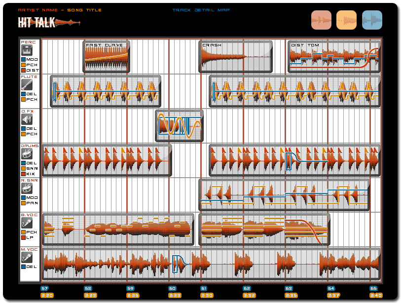
now lays before your eyes - Hit Talk's Track
Detail Map. The map provides a wealth of music
production information by revealing, with mind-boggling
precision, specific track-by-track techniques and automation
within a hit song's production. With each Hit Report,
we explain in great detail the Track Detail Map's contents,
revealing insider production knowledge found nowhere
else.
Here's
how it works: The bottom of the Track Detail
Map shows the song section's timeline and numbered
bars. The map contains 5-7 tracks. Tracks are labeled
at left, and divided into clips. We pick the most noteworthy
tracks, plus the most enlightened production techniques,
and illustrate (with great detail) each track's modulations,
effects, envelopes, pitch/midi data, automation, and
more via color coded lines. For example, delay and reverb
illustrations offer 4 dimensions of detail: first, a
vertical line which represents a track's original dry
signal; second, a vertical line (or sometimes a 3rd
and 4th) that represent time based reflections such
as eighth or sixteenth notes; third, a sloping line
representing the length of feedback/reverb; and finally,
fourth, a horizontal line representing the duration
of the effect. Additionally, each track detail map provides
a shorthand legend on the left side of every track!
The
Track Detail Map proves especially
useful as you listen to a song in real time, referencing
what you see in the map's illustration against the song's
audio. Starting with our Paper Planes Hit Report, every
report will contain a Track Detail Map. And really,
what better way is there to learn from the hits than
to see them spelled out track-by-track as they might
appear in the Pro-Tools or Logic session that created
them?! Plus, we include extended commentary for all
our Track Detail Maps. We provide you a wealth of step-by-step
explanations and analysis to ensure you fully grasp
the complex processes illustrated in our maps, not to
mention bonus illustrations from popular music software.
Simply put, we explain it all!
Song
Arrangement Map

If you've ever dreamed of seeing what a hit song's arrangement
and layout looked like in a single glance, you'll love
Hit Talk's Song Arrangement Map - included
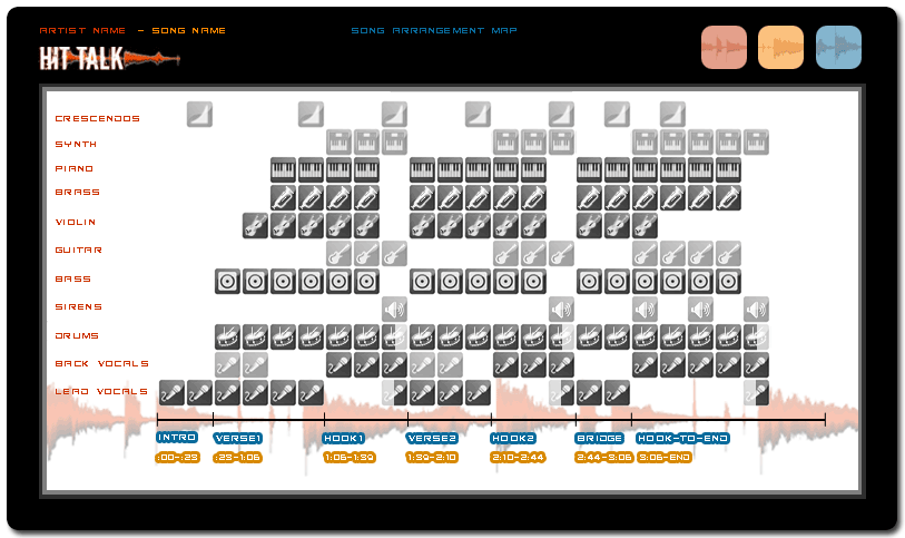
in every Hit Report we offer! The map's vertical axis
divides the song up for you on a track-by-track basis:
drums, percussion, lead vocals, background vocals, bass,
guitar, brass, strings etc. - even sound fx, crescendos,
and decrescendos! The map's horizontal axis reveals
where a song's tracks playback, at what level they playback,
where they build-up, where they break-down, and where
they mute. Each song part (intro, verse1, hook1, verse2,
hook2, bridge, and so on) is labeled in blue, all track
icons represent a length of four bars. Dark gray icons
represent the prominent parts in the song's mix while
the lighter gray icons represent quieter parts. Certain
icons are half-shaded symbolizing mutes and break-downs
as they occur within specific four bar phrases.
In
the above example, you can see the song begins with
a bare lead vocal track and builds quickly in the first
verse, adding backup vocals, bass and violin. 8 bars
into the first verse the song builds further, adding
brass and piano, while backup vocals drop out of the
mix. Each of the song's hooks reveal yet more interesting
production detail beginning by adding a soft guitar
and synth to the background of the mix, while backup
vocals assume the foreground. Also, notice how most
song elements drop out of the mix during the last 4
bars of each hook. During the final 2 bars of the hook,
a catchphrase is sung on both vocal channels accompanied
only by the guitar, synth and percussion accents, while
at top a reverse crash or swell acts as a segue into
the song's next section. This is the type of exciting
production and arrangement detail you can expect from
all our Song Arrangement Maps. Studying
a song's transitions by ear can be frustrating, making
analyzing and discovery of a song's arrangement a daunting
challenge. With Hit Talk's Song Arrangement Maps laid
out before you, an entire song's production arrangement
becomes an instant revelation! Now you can see exactly
how the song is put together, from start to finish.
Chord Progression Map

Keeping
your music theory skills sharp is vital to producing
powerful hooks and chord progressions that can blossom
into hits. Nurturing your keyboard skills is tantamount
to developing a well-rounded production style, and that's
why you'll love Hit Talk's Chord Progression
Maps. Every Hit Report includes a chord progression
map that enables you to learn chord theory from all
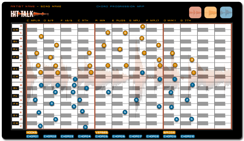
the hit songs covered on Hit Talk! The chord map illustrates
every finger position per chord, on both the vertical
and horizontal axes. The blue circles represent the
left hand; the yellow circles represent the right. The
fingers are numbered from 1 to 5, thumb to pinky. Each
chord is labeled by name at the top of the diagram.
All finger positions marked on the chord map represent
proper keyboard technique, allowing you to sharpen your
keyboard skills all the while learning the exact chord
progressions used in top hit singles. Hit Talk's Chord
Progression Maps offer a quick, convenient,
and constructive way to grasp the chord structure behind
many of today's hits and improve your music theory skills
at the same time.
Song
Format Map

If
you've ever wanted to quickly know exactly what song
format, key signature, and tempo a given hit song follows,
then you'll love Hit Talk's Song Format Maps.
Each song format map displays a precise overview of
a given hit song's sectional breakdowns, key signature,
and tempo from start to finish. Instantly, you're able
to grasp the entire formatting of a given song to study
or make your own! Each song map splits up all major
song divisions for you such as intro, verse1, verse2,
hook1, hook2, bridge, outro, and more allowing you to
see exactly where they occur along the song's timeline.
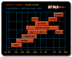
Frequency Separation Map

Knowing
exactly how to mix like heavy-weight producers and attain
a mix worthy of Billboard status takes lots of experience
and skill. Carving each track's frequency spectrum to
blend sonically with all other tracks within a song's
mix requires a professional ear and adherence to detail.
Hit Talk's Frequency Spectrum Maps
give you this detail by offering a visual snapshot of
any hit's mix and frequency balance! Instantly, you're
able to peer inside a song's mix and witness the frequency
range occupied by each track within a full production.
Frequency Spectrum Maps enable you to improve your understanding
of instrument placement within a song utilizing equalization,
low pass filtering, high pass filtering, and more. Hit
Talk's Frequency Separation Map is
a concise illustration of the frequency spans covered
by each specific instrument within a song's mix. In
the above example, each orange horizontal bar corresponds
to exactly what frequency range each instrument envelops.
Understanding hit songs' frequency separation will help
you get closer to obtaining a hit-worthy mix of your
own, keeping all parts of your mix well-separated and
situated for optimal sonic blend and balance.
Melody Map

Solid
keyboard technique is a crucial production skill possessed
by today's top music producers. To this end, in combination
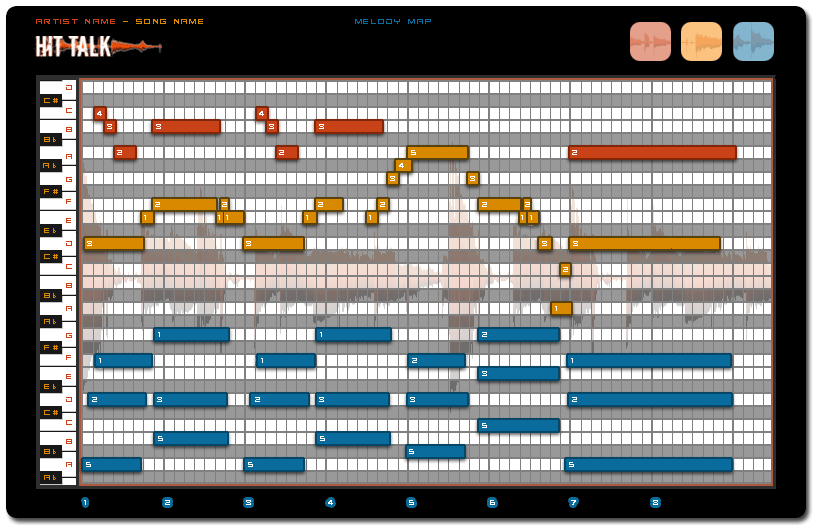
with the chord map, the Melody Map
is one of Hit Talk's most powerful educational tools.
Formatted exactly like a midi piano roll, the melody
map illustrates every part of a song's hook by showing
the right hand part in yellow and the left hand part
in blue, much like the chord map. In addition, over-dubbed
parts are illustrated in red, and can belong to the
left or right hand. One of the most enlightening aspects
of the melody map is that it plots finger positions.
Since the notes are numbered 1-5 - thumb-pinky, like
the chord map, the melody map displays the most effective
finger positions for performing a particular melody.
In the example above, the melody starts with the middle
finger on G, then the thumb crosses underneath to A.
This makes it possible to play the lead melody entirely
with the right hand while chording with the left (blue).
This is indispensable information for keyboardists who
might otherwise be tempted to start the melody using
the thumb. The melody map also reveals, in thorough
detail, the many rhythmic nuances and subtle melodic
evolutions inherent in a clever melody. Combined with
the Hit Talk's chord map, the Melody Map
will improve your keyboarding skills exponentially,
even after buying only a few hit reports.
Groove Analysis Map

A
big part of what makes hit songs sound great is the
deliberate deviation of conventional rhythm and quantization.
What does this mean? Instead of producing rhythms and
melodies that lock 100% to a sequencer's grid, hit producers
intentionally offset a song's drum rhythms, melodic
rhythms, and more. Why? To create natural, humanized
rhythmic feels that lend strength to a hit song's grabbing
power. Hit Talk's Groove Analysis Maps
help you see exactly how it's done by illustrating a
song's syncopation, feel or subtle deviation from a
100% quantized grid. In short, Hit Talk's groove maps
illustrate any rhythmic liberties taken by a producer
or musician. The time scales represented by Groove Analysis
Maps vary depending on what needs to be illustrated.
A groove map can represent 1, 2 or 4 bars depending
on the groove being analyzed.
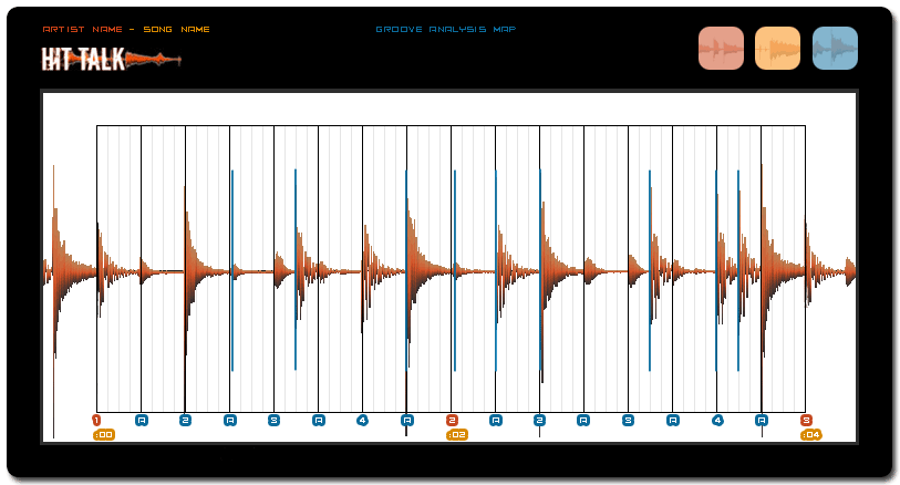
The
above example map shows a 2-bar drum beat. The black
lines represent 8th notes, and the gray lines represent
32nd notes. The blue text at the bottom of the diagram
shows the 8th notes as they might be counted while playing
them. The "A" stands for "and": every odd 8th note.
The beat is almost fully quantized, or nearly 100% locked
to the song's tempo grid. However, the first and fourth
pulse markers (the blue vertical lines) show the quieter
hi-hat notes landing just behind the beat, by less than
a 32nd note. That may not seem like much, but it's precisely
the amount of rhythmic offset needed to give the drum
riff a natural feel. All remaining blue pulse markers
show off the rhythm's planned syncopation. For example,
the snare drum lands on the "and" of the first "4" count;
in an un-syncopated rhythm, the snare normally falls
directly on the "4" count. This creates a
deliberate rhythmic offset that defies the expectations
of listeners, adding flavor and variety to the rhythm.
To gain skill and insight over any hit song's subtler
feels and nuances of rhythm, Hit Talk's Groove
Analysis Maps are key!
|

